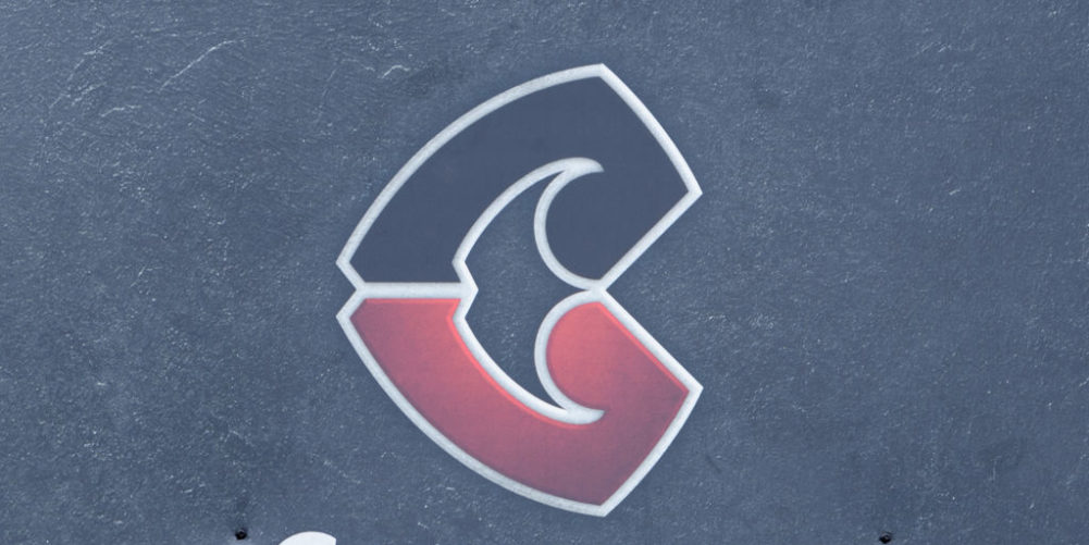
Reigning Super Rugby champions Crusaders have scrapped their medieval knight and sword logo and replaced it with a new Māori-inspired design.
The decision comes following a lengthy review by the New Zealand franchise into its branding in the wake of the Canterbury mosque shootings on 15 March, which claimed the lives of 51 people.
Senior executives at the Canterbury-based Crusaders and at New Zealand Rugby contemplated changing the name of the team, to avoid any distinction with the medieval crusades when Christians battled Muslims.
“While the main focus of the brand review was not the club's name, it did consider whether alternative name options would more accurately reflect the club's identity and story,” the Crusaders and NZ Rugby said in a joint statement.
“Ultimately, it was decided that no name better represented the club's commitment to living its values – crusading for social improvement and inclusiveness, and crusading with heart for our community and for each other – than ‘Crusaders' did.”

The new logo Super Rugby's most successful team will integrate in 2021 uses a styled red and black coloured ‘C' shape.
Tied in with the badge is the phrase ‘ma pango, ma whero, ka oti te mahi' which translates from Maori as ‘with red and black, the work is complete'.
Team coach Scott Robertson commented: “When you're a leader you've got to know where you've come from to know where you're going, and the legacy of this club is a big part of who we are.”


